Lesson 17 Plotting Functions
“A picture is worth a thousand words.” Unknown.
“Mathematics is the art of giving the same name to different things.” Henri Poincaré
Introduction
We now have a solid foundation in coordinate geometry, vectors, and matrices. We can now locate points, describe motion with vectors, and transform objects using matrices. But numbers and equations, no matter how elegant, often remain abstract until we see them. The next powerful step is to bring these mathematical objects to life on the screen.
The central idea is that a function is a rule that takes an input and produces an output. When we plot that rule, we turn the invisible relationship into a visible picture. Suddenly, patterns jump out, behavior becomes intuitive, and understanding deepens in a way that equations alone cannot provide.
Plotting is the bridge between symbolic mathematics and human intuition. It lets us see how functions behave, how vectors move, and how physical systems evolve.
In this lesson we will use Wolfram Language (WL) to create a rich variety of plots. You already have experience with symbolic computation, basic WL programming, and simple graphics from earlier lessons. Now we put those skills to work visualizing the ideas from coordinate geometry, vectors, and matrices.
We begin with the question why plot functions at all? Then we explore different types of plots—line plots, scatter plots, parametric plots, and contour plots—each suited to different kinds of mathematical and physical questions. We will visualize oscillations, the motion of a simple pendulum, optical phenomena, waves, and circular motion. You will learn how to customize plots to make them clear and beautiful, how to show the superposition of waves, and how symmetry appears in trigonometric functions. Finally, we will look at data visualization and advanced plotting options that let you create publication-quality figures for your own theoretical work.
By the end of this lesson you will have a powerful new tool in the ability to turn abstract functions and physical laws into clear, compelling visual stories. Plotting functions is not just a convenience—it is a fundamental way of thinking and discovering in theoretical physics.
Why Plot Functions?
We have spent many lessons working with symbols, equations, vectors, and matrices. We can solve problems, manipulate expressions, and describe physical laws with precision. Yet something is often missing. The numbers and symbols remain abstract until we see them take shape.
The fundamental idea is that a function is a rule that connects one quantity to another. When we plot that rule, we turn the invisible relationship into a visible picture. Suddenly patterns emerge, behavior becomes intuitive, and understanding deepens in ways that equations alone rarely achieve.
Plotting transforms abstract mathematics into something we can see, explore, and intuitively grasp.
An equation such as ![]() tells us a relationship, but—as we have seen—a plot shows us the graceful parabola it produces. A vector equation describing circular motion tells us the path is a circle, but a plot lets us watch the motion unfold. A matrix transformation tells us how points move, but a plot shows the entire figure rotate or stretch before our eyes.
tells us a relationship, but—as we have seen—a plot shows us the graceful parabola it produces. A vector equation describing circular motion tells us the path is a circle, but a plot lets us watch the motion unfold. A matrix transformation tells us how points move, but a plot shows the entire figure rotate or stretch before our eyes.
Such plots help us develop intuition. In mechanics, seeing the position, velocity, and acceleration curves of a pendulum makes the concept of simple harmonic motion far more real. In optics, plotting ray paths through a lens reveals how images form.
Sometimes a plot reveals something the algebra hid. A small change in a parameter might cause a dramatic shift in behavior. A function that looks simple on paper may have surprising symmetries or singularities when drawn. These visual discoveries often lead to deeper questions and new insights.
A well-made plot can communicate an idea more effectively than pages of equations. When you share your theoretical work—whether in a notebook, a report, or a presentation—a clear graph frequently conveys the essential behavior at a glance.
Plotting functions is therefore not merely a convenience. It is a fundamental way of thinking in theoretical physics. It bridges the symbolic and the visual, the abstract and the concrete, and turns mathematics into a living tool for discovery.
In the sections that follow, we will learn how to create a rich variety of plots in Wolfram Language and use them to explore the ideas from coordinate geometry, vectors, matrices, and classical mechanics.
Plot[] for Functions
We have seen the power of turning mathematical relationships into visible pictures. For many lessons we have used the Plot[] command in Wolfram Language. Iyt is time to expoore this command in detail.
The central idea is simple, give the computer a function and a range of input values, and it will calculate many points and connect them into a smooth curve. This single command brings an entire function to life on the screen. Plot[] is the bridge that turns a symbolic rule into a visible graph.
![]()
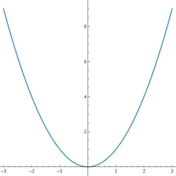
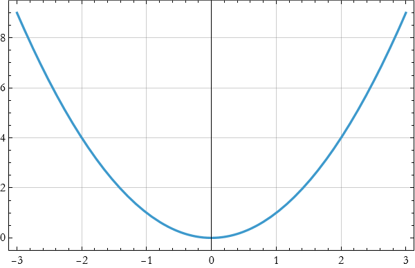
For example, to plot the function ![]() from x=−3 to x=3, we naively write,
from x=−3 to x=3, we naively write,
![]()
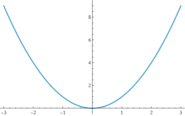
Wolfram Language automatically chooses a reasonable number of points, connects them smoothly, and scales the axes to show the important behavior.
Plot becomes truly powerful when you use its options to customize the appearance and focus.
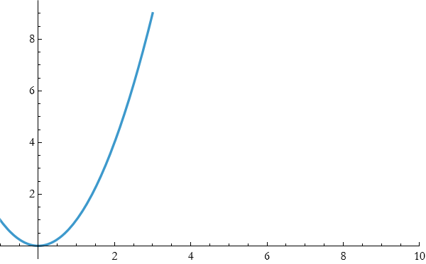
PlotRange Controls exactly what part of the graph is shown.
![]()
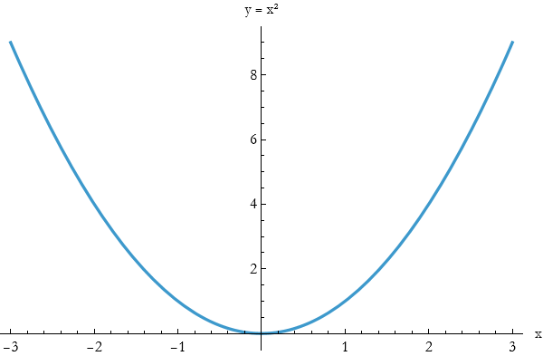
AxesLabel produces clear labels to the axes.
![]()
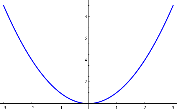
PlotStyle can cChange color, thickness, and style.
![]()
AspectRatio can control the shape of the plot (useful for making circles look circular).
![]()
You can combine many options at once.
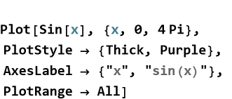
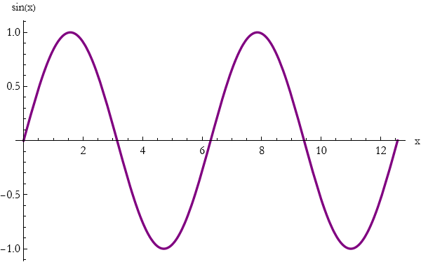
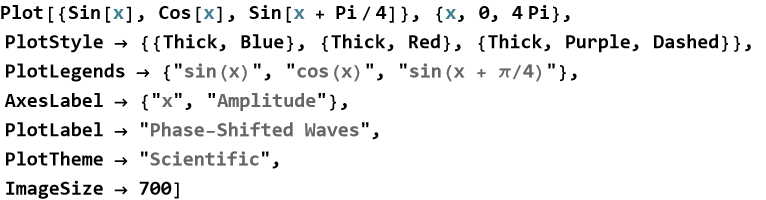
You can plot several functions on the same graph by putting them in a list.
![]()
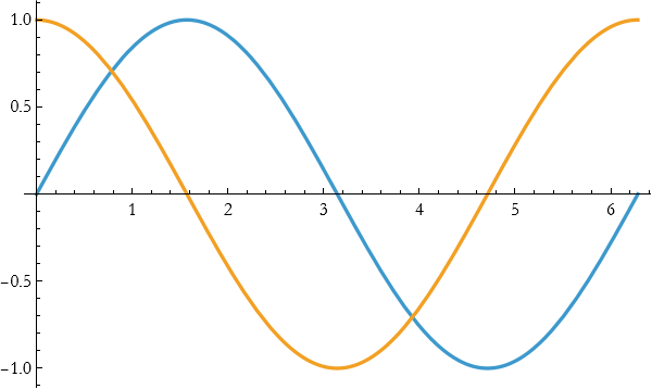
This makes it easy to compare related functions or to visualize superposition. By mastering Plot and its options, you gain the ability to turn any function—whether from pure mathematics, classical mechanics, or optics—into a clear, publication - quality picture. This skill will serve you throughout the rest of the book and in your own theoretical explorations .
Exercise 17.1:
a) Use Plot to graph the function ![]() from x=−3 to x=3. Add the options AxesLabel -> {“x”, “y”} and PlotStyle -> Thick. Describe the main features you see.
from x=−3 to x=3. Add the options AxesLabel -> {“x”, “y”} and PlotStyle -> Thick. Describe the main features you see.
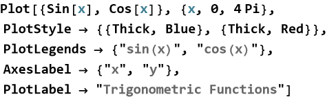
b) Plot y=sin x and y=cos x on the same graph for x from 0 to 4π.
1) Use a list inside Plot.
2) Add the option PlotLegends -> “Expressions” to label the curves.
3) Explain what the plot shows about the relationship between sine and cosine.
c) Plot y=tan x from x=−π/2 + 0.1 to x=π/2−0.1
. 1) Use PlotRange -> {-10, 10} to control the vertical scale.
2) Add PlotStyle -> {Thick, Red}.
3) Why is it important to restrict the domain when plotting functions with discontinuities?
d) Explain in your own words why the Plot command and its options are powerful tools for theoretical physics.
e) How does plotting help you understand a function better than looking at its equation alone?
Functions of More than One Variable
So far we have mostly worked with functions that take a single input and produce a single output. But the world is rarely that simple. Temperature at a point in a room depends on both x and y coordinates. The electric potential near a charge depends on all three spatial coordinates. The height of a mountain depends on latitude and longitude. Many important quantities in physics depend on several variables at once.
The central idea is that a function can take more than one input. We write f(x, y) or f(x, y, z) to show that the output depends on multiple independent quantities.
Functions of several variables let us describe how a quantity changes when we move in different directions in space.
A function of one variable, such as y=f(x), produces a curve when plotted. A function of two variables, z=f(x,y), produces a surface in three-dimensional space. A function of three variables produces a four-dimensional object that is harder to visualize directly, but we can still explore slices and level sets.
Wolfram Language gives us powerful tools to visualize these functions. The command Plot3D creates a three-dimensional surface.
![]()
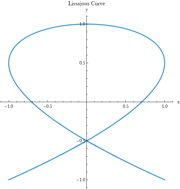
For a top-down view that shows level curves (contours of constant height), use ContourPlot.
![]()
These visualizations immediately reveal hills, valleys, ridges, and saddle points that would be difficult to see from the equation alone.
Definition 17.1 Function of More Than One Variable: A rule that takes two or more input values and produces a single output value is called a function of more than one variable.
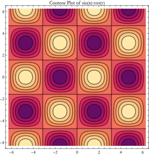
Definition 17.2 Level Curves and Level Sets: When a function depends on more than one variable, its output value can stay the same even as the inputs change. Imagine slicing through the surface produced by a function of two variables at a constant height. The curve formed by all the points where the function has exactly the same value is called a level curve. More generally, for a function of any number of variables, the set of all points where the function equals some constant value is called a level set. Level curves and level sets show us where a quantity remains constant as we move through space. In two dimensions we visualize level curves with the command ContourPlot. Each line on the plot corresponds to a different constant value of the function. Closely spaced level curves indicate steep change; widely spaced curves indicate gentle change. In three dimensions, level sets become surfaces (equipotential surfaces, isotherms, isobars, etc.). In higher dimensions they become harder to draw, but the underlying idea remains the same: they reveal the “contours” of constant value in the function’s landscape.
By learning to work with and visualize functions of several variables, you gain the ability to describe a much richer range of physical phenomena—from fields in space to waves on a surface to temperature distributions in materials.
Exercise 17.2:
a) Consider the function ![]() .
.
1) Use Plot3D to graph this function over x and y from -3 to 3.
2) Use ContourPlot to show the level curves.
3) Describe in words what the surface looks like and what the contour lines represent.
b) Plot the function ![]() using both Plot3D and ContourPlot.
using both Plot3D and ContourPlot.
1) Describe the shape you see.
2) Where is the surface highest and lowest in the plotted region?
3) Explain what the plot shows about the relationship between sine and cosine.
c) Plot y=tan x from x=−π/2 + 0.1 to x=π/2−0.1
. 1) Use PlotRange -> {-10, 10} to control the vertical scale.
2) Add PlotStyle -> {Thick, Red}.
3) What do the contour lines look like near the origin?
d) The gravitational potential near a point mass can be approximated in two dimensions as ![]() (ignoring constants).
(ignoring constants).
1) Plot this function using Plot3D over a suitable range that avoids the origin.
2) Use ContourPlot to show the equipotential lines.
3) Explain the physical meaning of the shape you see.
e) A simple two-dimensional wave is given by h(x,y)=sin(x)cos(y).
1) Create both a Plot3D and a ContourPlot of this function.
2) Describe the pattern of crests and troughs.
f) Consider z=a sin(x)+b cos(y).
1) Plot this surface for a=1, b=1.
2) Change the values of a and b and plot it again. Describe how the surface changes.
3) What happens when a=0, or b=0?
g) Explain in your own words why functions of more than one variable are important in physics.
h) How does visualization with Plot3D and ContourPlot help you understand these functions better than the equation alone?
i) Suggest one physical quantity (temperature, potential, wave height, etc.) that naturally depends on two or three variables and describe how you might plot it.
Plot3D[]
We first met the Plot3D command when exploring functions of two variables in the previous section. Now we take a closer look at this powerful tool and learn how to use its many options to create clear, insightful, and beautiful visualizations.
The central idea remains the same, give Wolfram Language a function of two variables together with a rectangular region in the x y-plane, and it will sample the function and display the resulting surface in three dimensions. The real power comes from customizing the plot so that the important features stand out.
Good visualization is not automatic—it is a craft. The many options of Plot3D let you shape the picture so that the physics or mathematics becomes obvious at a glance.
Once you have a basic Plot3D, you can control exactly what the reader sees.
PlotRange allows you to focus on the interesting part of the surface.
![]()
BoxRatios make the bounding box have natural proportions (especially useful for spheres and paraboloids).
![]()
ViewPoint allows you to choose the best angle to reveal the shape.
![]()
PlotStyle allow you t control color, opacity, and shininess.
![]()
Mesh allows you to remove or customize the grid lines on the surface.
![]()
AxesLabel and PlotLabel allows you to add clear, informative labels.
When visualizing physical quantities combine these options to make the important features stand out. A good plot should immediately convey the essential behavior, where the maxima and minima are, where the surface is steep or flat, and how the shape relates to the underlying physics.
Exercise 17.3:
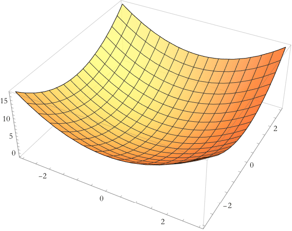
a) Use Plot3D to graph the function ![]() over x and y from -3 to 3. Add the option PlotStyle -> Directive[Orange, Opacity[0.8]]. Describe the shape of the surface and what it represents physically.
over x and y from -3 to 3. Add the option PlotStyle -> Directive[Orange, Opacity[0.8]]. Describe the shape of the surface and what it represents physically.
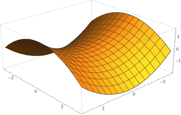
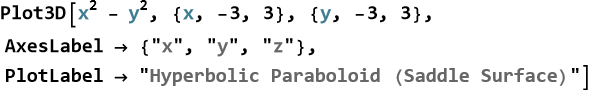
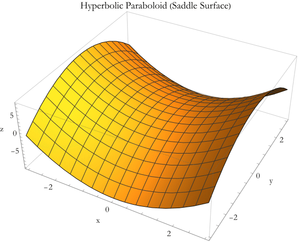
b) Plot the saddle surface ![]() for x and y from -3 to 3.
for x and y from -3 to 3.
1) Use ViewPoint -> {2.5, 2.8, 1.6} to get a good perspective.
2) Add BoxRatios -> {1, 1, 0.8} and appropriate AxesLabel.
3) Explain why choosing a good viewpoint matters when visualizing surfaces.
c) Create a plot of z=sin(x)cos(y) over x and y from −2π to 2π.
1) Remove the mesh lines with Mesh -> None.
2) Use a thick, semi-transparent cyan style.
3) Add a meaningful PlotLabel. Describe the pattern of hills and valleys you see.
d) Plot both ![]() and z=4 (a horizontal plane) on the same graph.
and z=4 (a horizontal plane) on the same graph.
1) Use a list of functions inside Plot3D.
2) Give each surface a different style (e.g., one opaque, one semi-transparent).
3) What does the intersection of the two surfaces represent?
e) The height of a simple water wave can be modeled as h(x,y)=0.5sin(2x)cos(3y).
1) Plot this surface using Plot3D.
2) Choose options that make the wave pattern clear.
f) Explain in your own words why Plot3D and its options are valuable tools for theoretical physics.
g) How does choosing good options (PlotRange, ViewPoint, PlotStyle, etc.) improve understanding?
Line Plots, Scatter Plots, Parametric Plots, and Contour Plots
We have already seen how Plot and Plot3D bring functions to life. Now we explore a richer palette of plotting tools in Wolfram Language. Each type of plot is designed for a different kind of question, and learning when and how to use them lets you tell clearer visual stories with your mathematics and physics.
The central idea is that different questions need different kinds of pictures. A line plot shows how one quantity changes with another. A scatter plot reveals relationships in data. A parametric plot traces paths or curves defined by time or another parameter. A contour plot shows level sets of a function of two variables. Choosing the right plot makes the underlying behavior obvious.
The basic Plot command creates smooth line plots of functions. You can make them clear and attractive with a few options.
When you have discrete data points, use ListPlot to make a scatter plot.
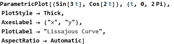
Some curves are best described parametrically. Use ParametricPlot.
For three-dimensional paths use ParametricPlot3D.
For functions of two variables, ContourPlot shows lines of constant value.
A few consistent options turn good plots into excellent ones:
Use PlotStyle -> Directive[Thick, Blue, Opacity[0.9]] for emphasis.
Add meaningful AxesLabel and PlotLabel.
Use PlotLegends when showing multiple curves.
Choose PlotTheme -> "Scientific" or "Detailed" for a clean, professional look.
Set ImageSize -> 600 or larger and appropriate AspectRatio.
Here is an example that combines many of these ideas for a polished line plot.
By choosing the right plot type and refining its appearance with these options, you transform raw mathematical relationships into clear, compelling visual stories that reveal the physics at a glance.
Exercise 17.4:
a) Plot ![]() ,
, ![]() , and
, and ![]() on the same graph for x from -2 to 2. Use thick lines with different colors and add a legend. Describe how the shapes differ and what this tells you about higher powers.
on the same graph for x from -2 to 2. Use thick lines with different colors and add a legend. Describe how the shapes differ and what this tells you about higher powers.
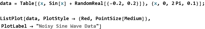
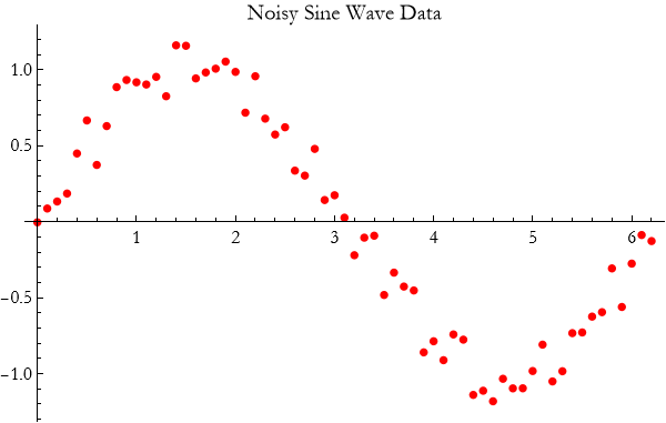
b) Generate a noisy dataset:
data = Table[{x, Sin[x] + RandomReal[{-0.2, 0.2}]}, {x, 0, 2 π, 0.1}];
1) Create a scatter plot with joined lines and large red points.
2) Use PlotTheme -> “Scientific” and appropriate labels.
3) Explain why scatter plots are useful when you have experimental or noisy data.
c) Plot the parametric curve defined by x=cos(3t), y=sin(2t) for t from 0 to 2π.
1) Use ParametricPlot with thick blue line.
2) Add axes labels and a title.
3) What shape does this curve form? Where do you see similar patterns in physics?
d) Plot the function z=sin(x)cos(y) using ContourPlot.
1) Add contour shading and thick contour lines.
2) Choose a good plot range and add a title.
3) What do the closed loops and saddle regions tell you about the function?
e) Explain in your own words when you would choose a line plot versus a parametric plot versus a contour plot.
f) Why is it important to use options such as PlotStyle, PlotLegends, and PlotTheme?
Visualizing Oscillations
Many systems in nature and in physics repeat their motion in regular cycles. A mass on a spring, a pendulum, a vibrating string, and even the electric current in an AC circuit all show this repeating behavior. To understand these systems deeply, we need to see how their position, velocity, and other quantities change over time.
The central idea is that oscillations are best understood when we turn their mathematical descriptions into clear visual pictures. Plotting position versus time, velocity versus time, or position versus velocity reveals patterns that equations alone often hide.
Visualization transforms abstract oscillatory motion into something we can see, compare, and intuitively grasp.
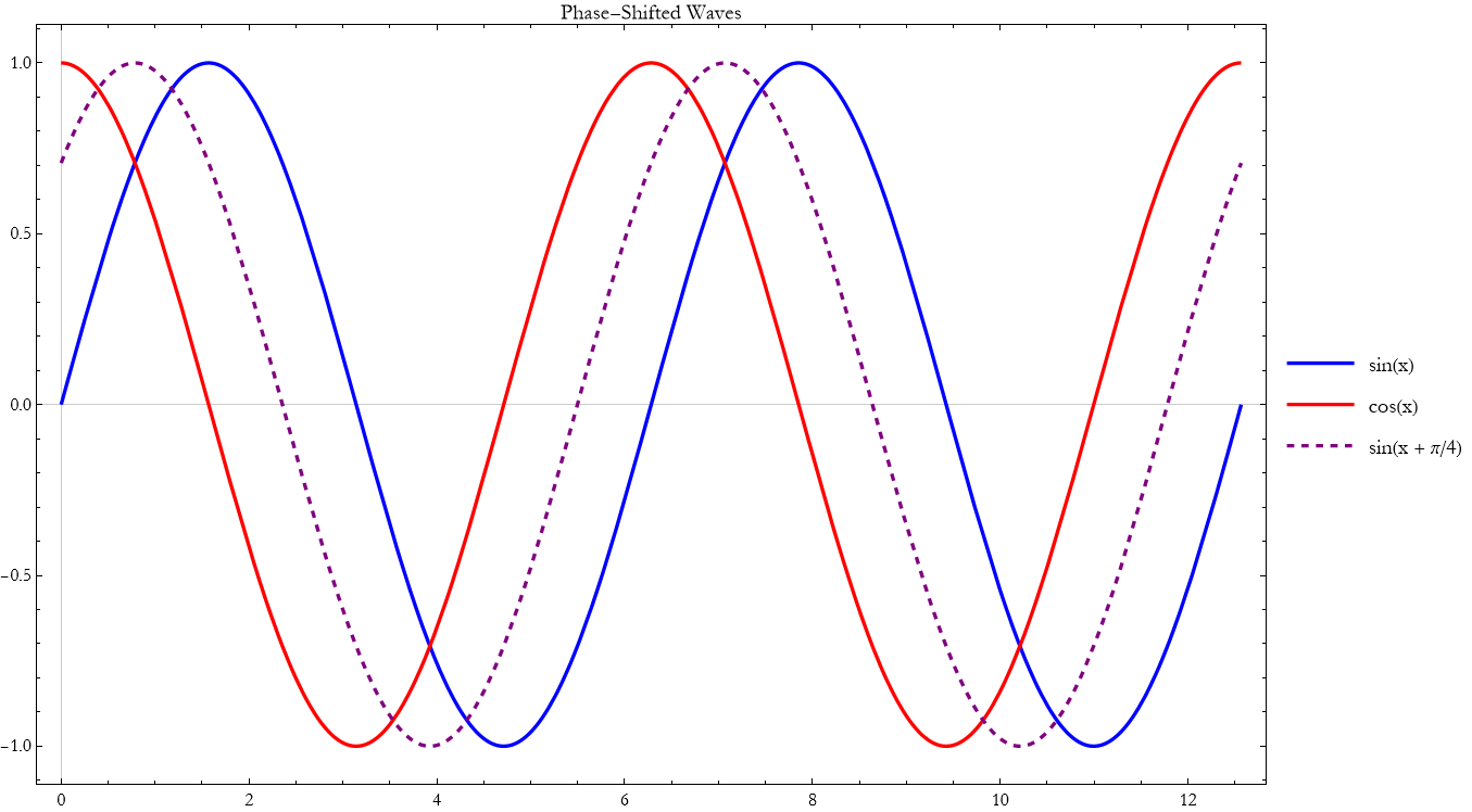
The simplest repeating motion is called simple harmonic motion. A typical example is a mass on a spring, where the position as a function of time is
![]()
(17.1)
We can plot this motion directly.
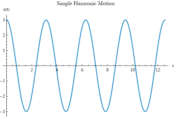
This plot immediately shows the amplitude, period, and phase of the oscillation.
We can also plot velocity and acceleration on the same graph to see their relationships.
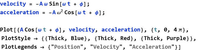
Notice how velocity leads position by a quarter cycle and acceleration is always opposite to position.
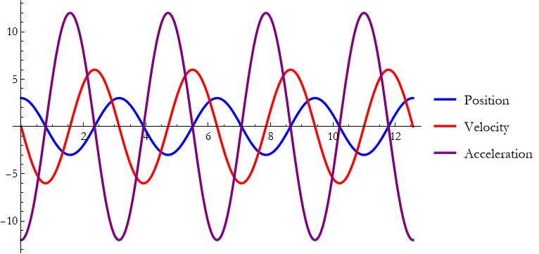
A particularly revealing picture comes from plotting position versus velocity parametrically.
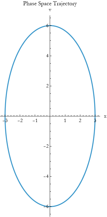
This produces a closed elliptical orbit in phase space—a beautiful way to see the conservation of energy in simple harmonic motion.
Real systems lose energy. We can visualize damped oscillations by adding an exponential decay factor and driven oscillations by adding a forcing term. Plotting these cases side-by-side shows how damping reduces amplitude and how driving can maintain or increase it.
Exercise 17.5:
a) The position of a mass on a spring is given by x(t)=4cos(2t).
1) Plot x(t) for t from 0 to 4π.
2) Add the velocity v(t)=−8sin(2t) on the same graph using a different color and a legend.
3) Describe the relationship you see between position and velocity.
4) Create a parametric plot of position versus velocity. Use ParametricPlot with AspectRatio -> Automatic.
5) Add appropriate labels and a title.
6) Explain what the shape of this plot tells you about energy conservation.
c) Explain why plotting position, velocity, and phase space together gives deeper insight than plotting position alone.
The Simple Pendulum
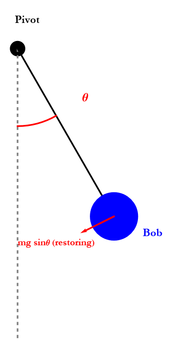
One of the most beautiful and important examples of oscillatory motion is the simple pendulum. A mass hanging from a string or a rigid rod swings back and forth under the pull of gravity. For centuries this simple device has helped us measure time, explore the laws of motion, and understand the concept of periodicity.
The central idea is that when displaced from its lowest point, the pendulum experiences a restoring force that pulls it back toward equilibrium. For small swings, this restoring force is approximately proportional to the displacement, leading to smooth, repeating motion.
The simple pendulum turns the constant downward pull of gravity into a regular back-and-forth oscillation. Imagine a pendulum of length l with bob mass m. When displaced by a small angle θ from the vertical, the component of gravity trying to restore it is approximately proportional to θ.
This leads to motion that is very close to simple harmonic motion.
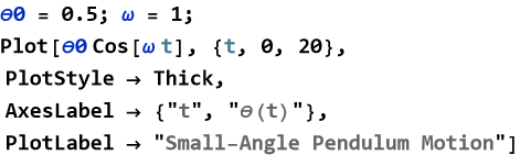
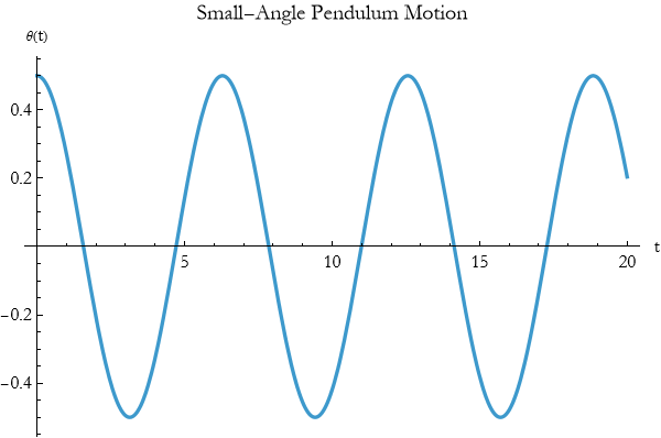
We can visualize the pendulum’s motion using the plotting tools you have already learned. The angular position as a function of time for small oscillations is
![]()
(17.2)
where ![]() .
.
Using Plot we can show the angular displacement over time.
A parametric plot of angular position versus angular velocity (phase space) shows a beautiful elliptical orbit for small oscillations.
For larger angles the motion is no longer perfectly harmonic. The period becomes slightly longer, and the waveform is no longer a pure cosine. Plotting both the small-angle approximation and the true motion side-by-side reveals how good the approximation is for different amplitudes.
The simple pendulum beautifully illustrates how a constant force (gravity) can produce periodic motion. It also shows the power of approximations: for small angles the motion is simple harmonic, but the true behavior is richer. This interplay between idealization and reality appears throughout theoretical physics.
By visualizing the simple pendulum with the plotting tools you now possess, you gain intuition that will help you understand more complicated oscillating systems — from molecules to bridges to clocks.
Exercise 17.6:
a) A simple pendulum has length l=1 m.
1) Draw a diagram showing the pendulum at equilibrium and displaced by an angle θ=20°.
2) Label the restoring force component.
3) For small angles, explain why the motion is approximately simple harmonic.
b) The angular displacement of a simple pendulum is approximated by θ(t)=0.5cos(2t) radians.
1) Plot θ(t) for t from 0 to ( 10 ) seconds.
2) Add the angular velocity on the same graph.
3) What is the period of the oscillation?
4) Create a parametric plot of angular position versus angular velocity. Use ParametricPlot with appropriate options.
5) Describe the shape of the trajectory.
6) What does this plot tell you about energy conservation?
c) The period of a simple pendulum is approximately ![]() .
.
1) Plot the period T versus length l for l from 0.1 m to 4 m.
2) Add the exact period for larger angles if possible.
3) Explain why the period is independent of mass but depends on length.
e) Why is the simple pendulum such an important example in classical mechanics?
f) How does visualization (position vs. time, phase space) help you understand its behavior?
Visualizing Optics
We have already learned how to trace light rays as vectors and how to visualize oscillatory motion. Now we combine these ideas to explore one of the most beautiful areas of classical physics, optics. Light rays traveling through lenses and reflecting from mirrors create images, focus beams, and reveal the world around us. The best way to understand these phenomena is to see them.
The central idea is that by representing light as rays (directed vectors) and plotting their paths, we can watch how optical systems bend and focus light. Visualization turns the abstract laws of reflection and refraction into clear, intuitive pictures.
Ray tracing with plotting tools lets us see how lenses and mirrors shape light.
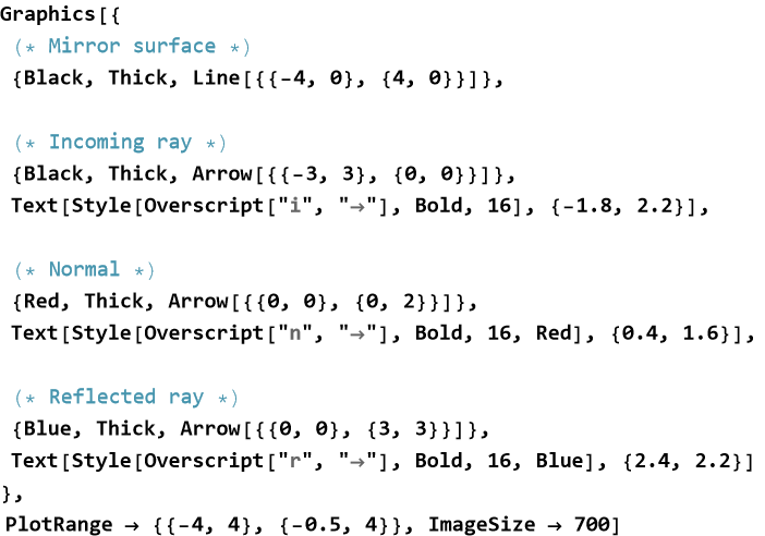
When a ray strikes a mirror, it bounces such that the angle of incidence equals the angle of reflection. Using vectors we can show this clearly.
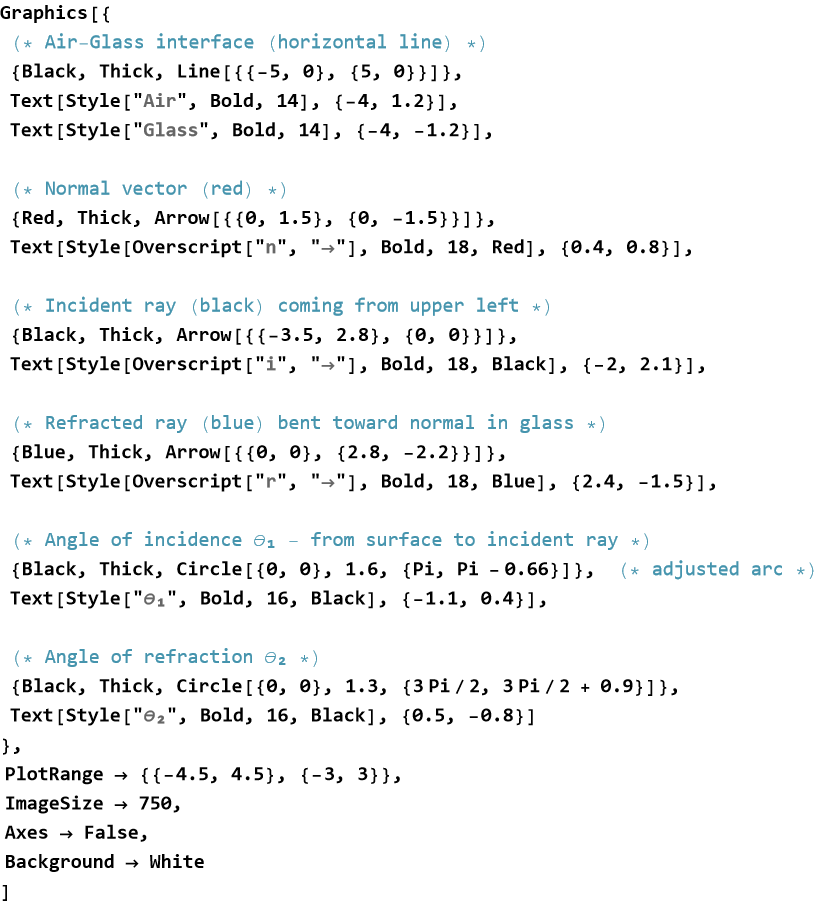
When a ray crosses from air into glass it bends toward the normal. We can visualize Snell’s law by plotting incident and refracted rays with different colors.
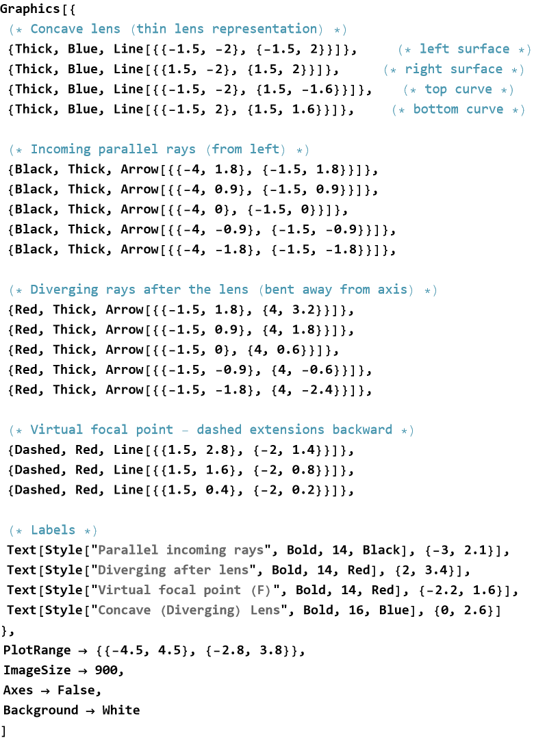
A convex lens focuses parallel rays to a focal point.
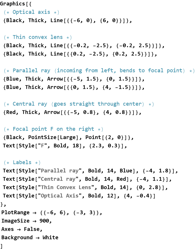
A concave lens diverges them. Plotting several rays through a lens shows how images are formed.
You can create these diagrams using Graphics and Arrow, or use ParametricPlot for curved paths. Combining multiple rays on one plot helps you see how an entire bundle of light behaves.
By visualizing optics with the same tools you used for oscillations and vectors, you gain deep intuition about how lenses form images, how mirrors focus light, and how optical instruments work. This visual approach makes theoretical optics far more accessible and enjoyable.
Exercise 17.7:
a) A ray with direction vector {3,−2} strikes a horizontal mirror.
1) Draw the mirror, incoming ray, normal, and reflected ray using Graphics and Arrow.
2) Label the incident and reflected rays.
3) Verify that the angle of incidence equals the angle of reflection.
b) A ray in air strikes a glass surface at 40° to the normal and refracts at 28° inside the glass.
1) Draw the incident ray, normal, refracted ray, and interface.
2) Label the angles clearly.
3) Explain why the ray bends toward the normal when entering glass from air.
c) Draw a ray diagram for a convex lens showing:
1) A ray parallel to the optical axis.
2) A ray passing through the center of the lens.
3) Where these two rays meet after the lens and what this point represents.
e) Create a complete ray-tracing diagram for a convex lens forming a real image.
1) Use different colors for incident and refracted rays.
2) Add labels for object, image, focal points, and optical axis.
3) Use options to make the diagram clear and publication-ready.
f) Why is ray tracing (visualizing rays as vectors) such a powerful tool in optics?
g) Compare how a convex lens and a concave lens affect parallel rays.
h) Suggest one optical instrument (telescope, microscope, camera) and describe how you would visualize ray paths through it.
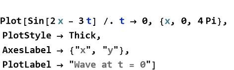
Visualizing Waves
We have already explored oscillations and how light rays travel through optical systems. Waves combine these ideas since they are disturbances that carry energy and information as they travel through space. Water waves, sound waves, light waves, and electromagnetic waves all show repeating patterns that move from one place to another.
The central idea is that a wave is a repeating disturbance that propagates. By plotting the wave’s shape at different times or showing its motion in space, we can see how amplitude, wavelength, frequency, and phase determine its behavior.
Visualization turns the mathematics of waves into moving pictures that reveal interference, superposition, and propagation in an intuitive way.
A disturbance that moves through space while carrying energy from one place to another is called a traveling wave. A simple traveling wave can be described by
![]()
(17.3)
We can visualize this wave at a fixed time.
Or animate it over time using Animate or by plotting several snapshots.
When two waves overlap, their displacements add. This is called superposition. Plotting two waves and their sum shows constructive and destructive interference clearly.
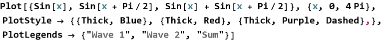
When two identical waves travel in opposite directions, they can form a standing wave. In a standing wave, certain points never move. These stationary points are called nodes. At a node, the crests of one wave always meet the troughs of the other, so the displacements cancel perfectly at all times. The points where the amplitude is maximum—where the crests of one wave always align with the crests of the other—are called antinodes. The visualization below shows fixed nodes and antinodes.
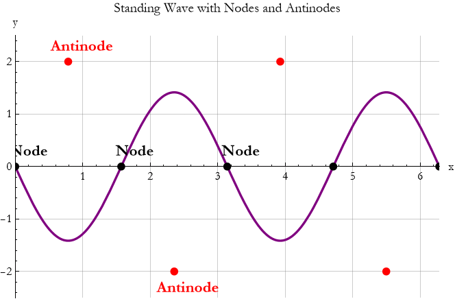
By using the plotting tools you learned in previous sections, you can turn the mathematics of waves into clear visual stories. These pictures make concepts like interference much more intuitive and prepare you for deeper studies in optics, acoustics, and quantum mechanics.
Exercise 17.8:
a) A traveling wave is given by y(x,t)=2sin(2x−4t).
1) Plot the wave at t=0.
2) Plot the wave at t=π/4 on the same graph using a different color.
3) Describe the direction and speed of the wave.
b) Plot the sum of two waves: ![]() and
and ![]() .
.
1) Plot all three curves (two individuals and the sum) with different colors and a legend.
2) Identify regions of constructive and destructive interference.
3) What happens to the amplitude of the resulting wave?
c) A standing wave is given by y(x,t)=3sin(2x)cos(4t)..
1) Plot the wave at t=0.
2) Use ParametricPlot or multiple snapshots to show the motion.
3) Mark the locations of nodes and antinodes on your plot.
e) Plot a traveling wave y=4sin(3x−6t) with attractive styling.
1) Use thick line, appropriate colors, and labels.
2) Add PlotLegends and a meaningful title.
3) Study the option Filling.
4) Experiment with Filling or GridLines to improve clarity.
f) Explain why plotting waves (traveling, standing, superposed) is more insightful than looking at their equations alone.
g) How does visualization help you understand interference and nodes/antinodes?
Symmetry in Trigonometric Functions
We have been plotting and exploring trigonometric functions such as sine, cosine, and tangent. As we look at their graphs, a striking feature often appears, that certain patterns repeat or mirror themselves in predictable ways. These repeating and mirroring behaviors are examples of symmetry.
Many trigonometric functions possess beautiful symmetries that reveal deep connections between their values at different angles. Recognizing these symmetries helps us understand the functions more deeply and often simplifies calculations.
Symmetry in trigonometric functions means that the graph looks the same after certain transformations—shifting, reflecting, or rotating.
Some functions are symmetric about the y-axis. These are called even functions. Cosine is a classic example of this, cos(−x)=cos x. Its graph is mirror-symmetric across the y-axis.
Other functions are symmetric about the origin. These are called odd functions. Sine is the prime example, sin(−x)=−sin x. Its graph looks the same if you rotate it 180° around the origin.
All basic trigonometric functions are periodic. They repeat their values after a fixed interval called the period. Sine and cosine have period 2π. Tangent has period π. This repeating symmetry means that once you know the behavior over one period, you know it everywhere.
You can see these symmetries clearly with plots.
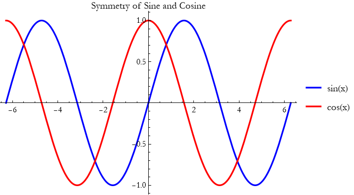
The plot immediately shows the odd symmetry of sine and the even symmetry of cosine, as well as their periodic nature.
Symmetry simplifies problems in physics and engineering. It helps us predict behavior in new regions without recalculating everything. In wave mechanics, symmetry explains interference patterns. In optics, it helps us understand lens and mirror behavior. In quantum mechanics, symmetry principles underlie many fundamental laws.
By learning to recognize and use symmetry in trigonometric functions, you gain both insight and efficiency in your theoretical work.
Complicated Trigonometric Functions in Two Dimensions
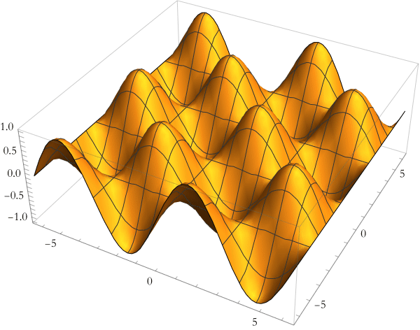
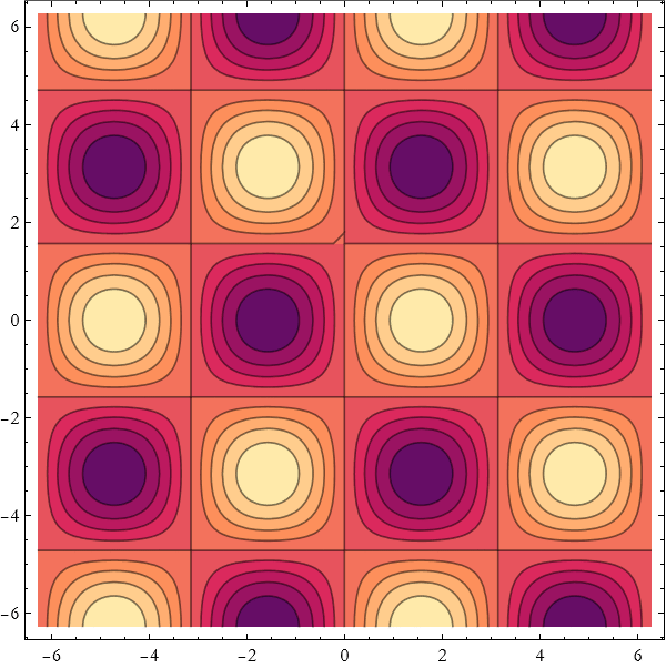
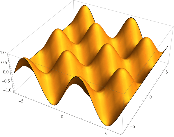
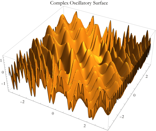
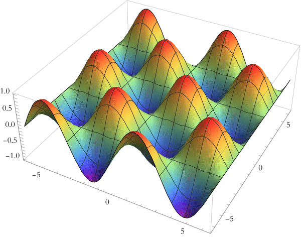
We have explored simple trigonometric functions and their symmetries. Now we move to richer territory with functions that combine sine and cosine in complicated ways involving two variables. These functions produce beautiful, intricate patterns that appear throughout physics.
When sine and cosine are combined with different frequencies, phases, or amplitudes in two dimensions, they create complex landscapes of hills, valleys, and swirling patterns. Plotting these functions reveals hidden order and beauty that the equations alone rarely show.
Complicated trigonometric functions in two dimensions turn simple waves into mesmerizing interference patterns.
One of the simplest ways to create complexity is to multiply two trigonometric functions.
Here is the contour plot of the same function.
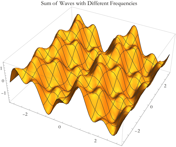
Adding waves with different frequencies produces beating patterns and more complicated landscapes.
![]()
Here are two particularly intricate functions you can explore.
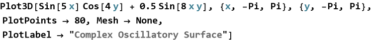
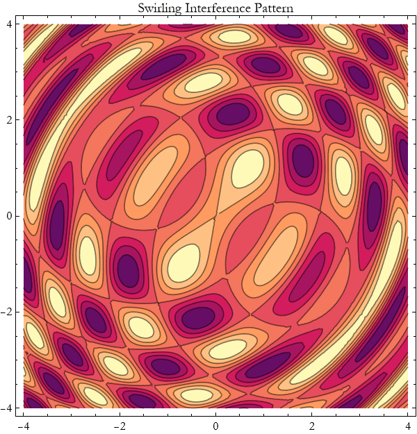
By plotting them, you gain intuition about how waves combine and interfere in real physical systems. Complicated trigonometric functions in two dimensions show us that even simple building blocks (sine and cosine) can produce astonishing richness when combined. This is a powerful reminder of the beauty and complexity hidden in classical physics.
Exercise 17.9:
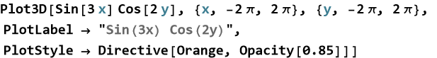
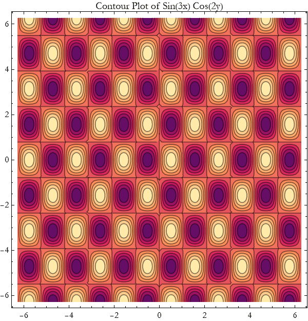
a) Consider the function z=sin(3x)cos(2y).
1) Plot this surface using Plot3D over x and y from −2π to 2π.
2) Create the corresponding ContourPlot.
3) Describe the pattern of peaks and valleys you observe.
b) Plot the function z=sin(2x)+0.8sin(5x)cos(3y).
1) Use Plot3D with good styling options.
2) Experiment with different coefficients and frequencies.
3) Explain how changing the frequencies affects the complexity of the surface.
c) Create and plot z=sin(5x)cos(4y)+0.6sin(8x y).
1) Use both Plot3D and ContourPlot.
2) Adjust PlotPoints to get a smooth picture.
3) Describe the swirling or checkerboard-like patterns you see.
e) Plot the superposition z=sin(x+y)+sin(x−y).
1) Use Plot3D and ContourPlot.
2) Simplify the expression mathematically and compare with your plots.
3) What physical phenomenon does this superposition represent?
f) Take any complicated trigonometric function of two variables.
1) Plot it with thick lines or good opacity.
2) Add meaningful AxesLabel and PlotLabel.
3) Experiment with PlotTheme and ColorFunction to make the plot more attractive and informative.
g) Why do complicated trigonometric functions in two dimensions produce such rich patterns?
h) How does visualization help you understand wave interference and superposition better than equations alone?
Data Visualization
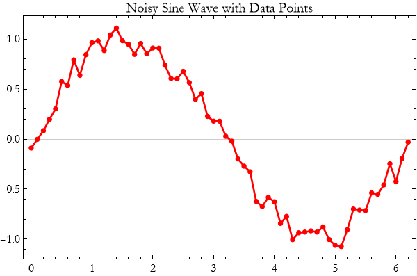
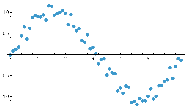
We have spent many lessons plotting functions and mathematical relationships. But in real theoretical and experimental work, we often deal with discrete data—measurements, simulation results, or observations. Turning these numbers into clear, compelling pictures is one of the most valuable skills you can develop.
This data tells a story, and visualization is how we let that story be seen. A well-made plot of data can reveal trends, outliers, and relationships that raw numbers hide.
The basic command for plotting data is ListPlot. It takes a list of points and displays them as markers.
When the data has a natural order, we can connect the points.
![]()
You can use the same customization options you learned earlier.
You can compare several datasets on the same plot.
Data visualization is essential when analyzing experimental results, comparing theory with measurement, or exploring simulation output. Whether you are plotting sensor data from a pendulum, light intensity from an interference experiment, or particle trajectories from a simulation, clear plots help you see the physics.
Exercise 17.10:
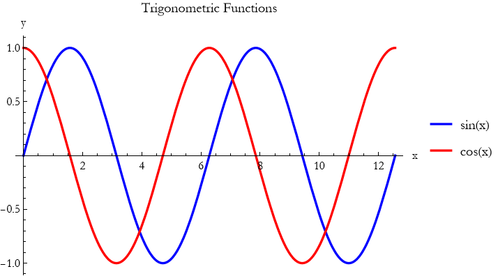
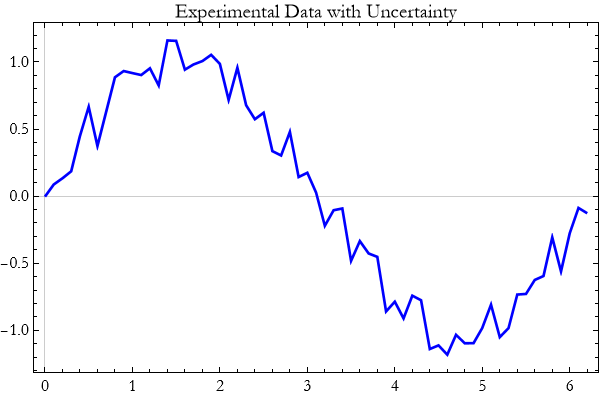
a) Generate a simple dataset: data = Table[{x, Sin[x] + RandomReal[{-0.15, 0.15}]}, {x, 0, 2 Pi, 0.2}];
1) Plot the data using ListPlot.
2) Add large red points and connecting lines.
3) Describe what the plot shows about the underlying sine wave.
4) Use PlotStyle, PlotTheme -> “Scientific”, and meaningful labels.
5) Add a title that describes the experiment.
6) Experiment with Joined -> True versus points only. Which is clearer?
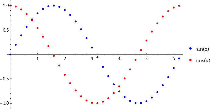
b) Generate two noisy datasets:
data1 = Table[{x, Sin[x]}, {x, 0, 2 Pi, 0.15}];
data2 = Table[{x, Cos[x] + 0.2}, {x, 0, 2 Pi, 0.15}];
1) Plot both on the same graph with different colors and a legend.
2) Add connecting lines.
3) What does the comparison reveal?
c) Simulate pendulum period data versus length:
lengths = Range[0.5, 3, 0.2];
periods = Sqrt[lengths] * 2 Pi / Sqrt[9.8] + RandomReal[{-0.05, 0.05}, Length[lengths]];
data = Transpose[{lengths, periods}];
1) Plot the data with ListPlot.
2) Add a theoretical curve for comparison.
3) Discuss how well the data matches the expected ![]() .
.
e) Take any dataset you have generated.
1) Improve it with appropriate PlotStyle, AxesLabel, PlotLabel, and size.
2) Try PlotMarkers or different point sizes.
3) Explain why good styling matters when presenting scientific results.
f) Explain in your own words why data visualization is an essential skill in theoretical and experimental physics.
g) How does plotting data help you compare theory with measurement?
Advanced Plot Options
You have now learned to create many different kinds of plots and to customize their basic appearance. But Wolfram Language offers a rich set of advanced options that let you add information, highlight features, and create truly professional visualizations. These tools turn good plots into outstanding ones.
Advanced options give you fine control over what is shown, how it is shown, and what extra information is added to the plot.
The option Filling lets you shade areas under or between curves.
RegionFunction allows you to show only part of a surface or curve.
![]()
sEpilog and Prolog let you add custom graphics on top of or behind the main plot.
![]()
GridLines and Frame improve readability.
![]()
ColorFunction gives you sophisticated control over coloring.
![]()
PlotMarkers is especially useful for scatter plots of data.
![]()
You can combine many of these options with PlotTheme and PlotLegends to create publication-quality figures quickly.
Advanced options let you highlight the physics you want to show—whether it is an interference pattern, a region of interest, or a comparison between theory and experiment. They turn a standard plot into a clear scientific communication tool.
Mastering these advanced options gives you the ability to create clear, beautiful, and informative visualizations that will serve you throughout your work in theoretical physics.
Exercise 17.11:
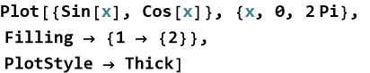
a) Plot y=sin x and y=cos x from 0 to 2π.
1) Look up the documentation on Filling and make notes in your notebook.
2) Use Filling -> {1 -> {2}} to shade between the curves. Explain what the syntax means.
3) Experiment with different filling styles.
4) Explain when filling is particularly useful in physics visualizations.
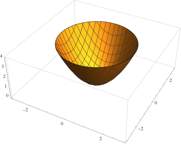
b) Plot ![]() from -3 to 3.
from -3 to 3.
1) Look up Epilog and make notes about it in your notebook.
2) Use Epilog to add a large red point and text label at the minimum.
3) Add an arrow pointing to the vertex.
4) Why are annotations like Epilog valuable when presenting results?
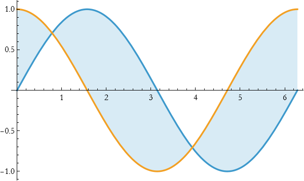
c) Plot the surface ![]() over x and y from -3 to 3.
over x and y from -3 to 3.
1) Look up and make notes about RegionFunction.
2) Use RegionFunction to show only the part where z<6.
3) Combine this with appropriate PlotStyle.
4) How does restricting the region help focus attention on important features?
e) Plot z=sin(x)cos(y) using Plot3D.
1) Look up ColorFunction and make notes in your notebook.
2) Apply a ColorFunction such as “Rainbow” or “TemperatureMap”.
3) Try ColorFunctionScaling -> False and observe the difference.
4) When would sophisticated color functions be useful in physics?
f) Create a single polished plot of a function or dataset of your choice.
1) Use at least three advanced options (e.g., Filling, Epilog, RegionFunction).
2) Make the plot clear and publication-ready.
3) Explain your design choices.
g) Why are advanced plot options important beyond basic plotting?
Summary
Write a summary of this lesson.
For Further Study
Micheal Trott, (2004), The Mathematica GuideBook for Graphics, Springer Science+Business Media. This is a fantastic book with lots of examples.
Chonat Getz, Janet Helmstedt, (2004), Graphics with Mathematica Fractals, Julia Sets, Patterns and Natural Forms, Elsevier. This has a lot of advanced applications.
Tom Wickham-Jones, (1994), Mathematica Graphics, Springer-Verlag, TELOS. This is an encyclopedic coverage, it is a bit old—so it does not cover a lot of new material. Most of the material is still valid.
Wolfram Language Plotting Tutorial by Wolfram (official)
https://www.youtube.com/watch?v=some-official (search “Wolfram Plotting Tutorial”)
Advanced Plotting in Wolfram Language by Wolfram Research (YouTube channel)
Official videos covering Plot, Plot3D, ContourPlot, ParametricPlot, etc.